|
Extensive reference for Modern Charts in Microsoft Access with properties, settings, enumerations, and more so you see what you can do with modern charts, how to create them, and what you can read and change with VBA (and hence, the real reason to create this page! A good reference for me and also you).
Charts give you a great way to visualize data! They're easy to create once you get the hang of it.
If printed, this would be about 50 pages. I chose not be break it up so everything is in one place for easy searching and reference. Hope you have as much fun with charts as I do.
NOTE: The Chart Types are updated with the new modern chart types, as of Autumn 2024. There are several new chart types. Those on 365 current channel will see them rolling out now; semi-annual channel next spring; and perpetual release after 2024 (they weren't included in Access 2024). I plan to update the rest of the REFERENCE with new Properties and Enumerations too
Colin Riddington has a nice page on the modern chart improvements: https://isladogs.co.uk/modern-chart-improvements
Colin is also updating this page on AccessForever https://www.accessforever.org/post/modern-chart-improvements
Maria shared this link for Microsoft's Help page with the new Modern Chart types: Create a chart on a form or report and gave a presentation on the new chart types (under Video)
Modern Charts in Access, Chart Objects
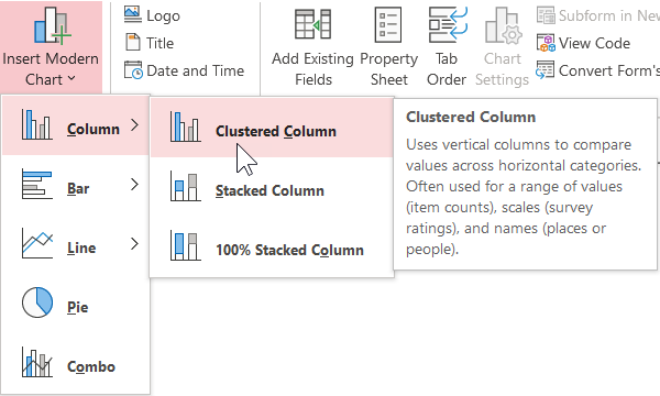
Value | Description | Icon | acChart constant |
---|---|---|---|
0 | Clustered Column | acChartColumnClustered | |
1 | Stacked Column | acChartColumnStacked | |
2 | 100% Stacked Column | acChartColumnStacked100 | |
3 | Clustered Bar | acChartBarClustered | |
4 | Stacked Bar | acChartBarStacked | |
5 | 100% Stacked Bar | acChartBarStacked100 | |
6 | Line | acChartLine | |
7 | Line Stacked | acChartLineStacked | |
8 | 100% Stacked Line | acChartLineStacked100 | |
9 | Pie | acChartPie | |
10 | Combo | acChartCombo | |
11 | Area | acChartArea | |
12 | Stacked Area | acChartAreaStacked | |
13 | 100% Stacked Area | acChartAreaStacked100 | |
14 | Radar | acChartRadar | |
15 | Radar Filled | acChartRadarFilled | |
16 | Box and Whisker | acChartBoxWhisker | |
17 | Bubble | acChartBubble | |
18 | Doughnut | acChartDoughnut | |
19 | Funnel | acChartFunnel | |
20 | Scatter | acChartScatter | |
21 | WordCloud | acChartWordCloud | |
? | Waterfall | acChartWaterfall? |
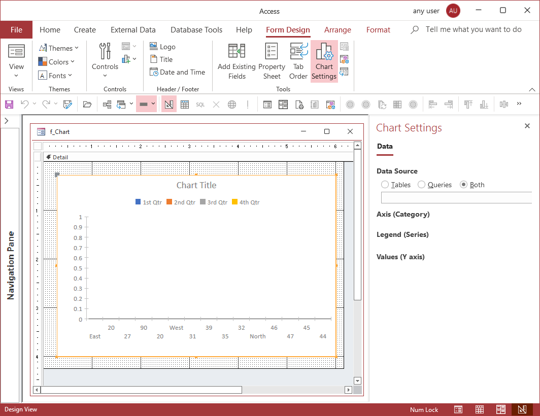
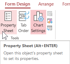
Toggle the Chart Settings pane on and off in the Tools group on the Design ribbon (near Add Existing Fields and Property Sheet). Several of the chart settings are also on the Property Sheet.
Data Source
Axis (Category)
Legend (Series)
Values (Y axis)
|
Data Series
Format Data Series
|
A Modern Chart object has the following properties and objects specific to charts. When these were enumerated, several of the data types reported as byte were changed to Integer or Long to match Help (which may not be right!), where Help even listed a data type.
When enumerating the properties, the TypeName function was used to get data type but often it was reported as Byte and that isn't necessarily right. For instance, a color number can be Long, so all the properties storing a color number are set to Long (of course, I have an Access database to track this information and generate HTML, smile).
Where values come from a list, there is a link to the enumeration, or to a page that has it. Enumerations and Lists are also shown on this page after properties. Press Alt-LeftArrow to go back to your previous spot on the page.
this needs updating with new properties corresponding to new chart types rolling out
Chart Property | Data Type | Tab | Values | Description |
---|---|---|---|---|
Chart | ||||
CategoryAxisFontColor | Long | Format | font color used by the category axis | |
CategoryAxisFontShade | Single | Amount of darkness of theme color. 100 is neutral, darker toward 0. 25 is 75% darkness. | ||
CategoryAxisFontSize | Integer | Format | font size used by the category axis | |
CategoryAxisFontTint | Single | Amount of lightness. 100=normal. 75=25% lighter | ||
CategoryAxisThemeColorIndex | Long | ThemeColorIndex | 0 to 11 for various named theme colors. -1=No Theme. | |
CategoryAxisTitle | String | Format | text for the category axis title | |
ChartAxis | String | Data | semi-colon delimited list of field(s) for the category axis | |
ChartLegend | String | Data | field name used by the chart legend | |
ChartSubtitle | String | Format | text for the chart subtitle | |
ChartSubtitleFontColor | Long | Format | font color used by the chart subtitle | |
ChartSubtitleFontShade | Single | Amount of darkness of theme color. 100 is neutral, darker toward 0. 25 is 75% darkness. | ||
ChartSubtitleFontSize | Integer | Format | font size used by the chart subtitle | |
ChartSubtitleFontTint | Single | Amount of lightness. 100=normal. 75=25% lighter | ||
ChartSubtitleThemeColorIndex | Long | ThemeColorIndex | 0 to 11 for various named theme colors. -1=No Theme. | |
ChartTitle | String | Format | text for the chart title | |
ChartTitleFontColor | Long | Format | font color used by the chart title | |
ChartTitleFontName | String | Format | font name for chart title | |
ChartTitleFontShade | Single | Amount of darkness of theme color. 100 is neutral, darker toward 0. 25 is 75% darkness. | ||
ChartTitleFontSize | Integer | Format | font size used by the chart title | |
ChartTitleFontTint | Single | Amount of lightness. 100=normal. 75=25% lighter | ||
ChartTitleThemeColorIndex | Long | ThemeColorIndex | 0 to 11 for various named theme colors. -1=No Theme. | |
ChartType | Long | Format | AcChartType | type of chart or acChartCombo if more than one chart type |
ChartValues | String | Data | semi-colon delimited list with field names to be plotted on the value (Y) axis of a chart | |
HasAxisTitles | YesNo | Format | true if the chart has a title on the category or value axis | |
HasLegend | YesNo | Format | True if the chart has a legend | |
HasSubtitle | YesNo | Format | true if the chart has a subtitle | |
HasTitle | YesNo | Format | true if the chart has a title | |
LegendPosition | Long | Format | AcLegendPosition | position of the legend for a chart |
LegendTextFontColor | Long | Format | font color used by the chart legend | |
LegendTextFontShade | Single | Amount of darkness of theme color. 100 is neutral, darker toward 0. 25 is 75% darkness. | ||
LegendTextFontSize | Integer | Format | font size used by the chart legend | |
LegendTextFontTint | Single | Amount of lightness. 100=normal. 75=25% lighter | ||
LegendTextThemeColorIndex | Long | ThemeColorIndex | 0 to 11 for various named theme colors. -1=No Theme. | |
PreviewLiveData | YesNo | Data | True if design view is updated as changes are made | |
PrimaryValuesAxisDisplayUnits | Byte | Format | AcAxisUnits | unit of measurement for values displayed on the primary axis |
PrimaryValuesAxisFontColor | Long | Format | font color used by the chart primary axis | |
PrimaryValuesAxisFontShade | Single | Amount of darkness of theme color. 100 is neutral, darker toward 0. 25 is 75% darkness. | ||
PrimaryValuesAxisFontSize | Integer | Format | font size used by the primary axis | |
PrimaryValuesAxisFontTint | Single | Amount of lightness. 100=normal. 75=25% lighter | ||
PrimaryValuesAxisFormat | String | Format | named or custom format for the primary value axis | |
PrimaryValuesAxisMaximum | Single | Format | maximum value that can be represented on the primary values axis | |
PrimaryValuesAxisMinimum | Single | Format | minimumj value that can be represented on the primary values axis | |
PrimaryValuesAxisRange | Byte | Format | AcAxisRange | behavior for representing minimum and maximum values on the primary values axis - Fixed or Auto |
PrimaryValuesAxisThemeColorIndex | Long | ThemeColorIndex | 0 to 11 for various named theme colors. -1=No Theme. | |
PrimaryValuesAxisTitle | String | Format | text for the primary axis title | |
RowSource | String | Data | name of the table/query or SQL statement with data for the chart | |
SecondaryValuesAxisDisplayUnits | Byte | Format | AcAxisUnits | unit of measurement for values displayed on the secondary axis |
SecondaryValuesAxisFontColor | Long | Format | font color used by chart secondary axes | |
SecondaryValuesAxisFontShade | Single | Amount of darkness of theme color. 100 is neutral, darker toward 0. 25 is 75% darkness. | ||
SecondaryValuesAxisFontSize | Integer | Format | font size used by the secondary axis | |
SecondaryValuesAxisFontTint | Single | Amount of lightness. 100=normal. 75=25% lighter | ||
SecondaryValuesAxisFormat | String | Format | named or custom format for the secondary value axis | |
SecondaryValuesAxisMaximum | Single | Format | maximum value that can be represented on the secondary values axis | |
SecondaryValuesAxisMinimum | Single | Format | minimumj value that can be represented on the secondary values axis | |
SecondaryValuesAxisRange | Byte | Format | AcAxisRange | behavior for representing minimum and maximum values on the secondary values axis - Fixed or Auto |
SecondaryValuesAxisThemeColorIndex | Long | ThemeColorIndex | 0 to 11 for various named theme colors. -1=No Theme. | |
SecondaryValuesAxisTitle | String | text for the secondary axis title | ||
TransformedRowSource | String | Data | auto-generated SQL string that is used to support aggregation, pivoting, and ordering of chart data. Generated from a combination of the RowSource property and selected axis fields. | |
Chart Collections | ||||
ChartAxisCollection | object | collection of all the ChartAxis objects in a chart | ||
ChartSeriesCollection | object | collection of all the ChartSeries objects in a chart | ||
ChartValuesCollection | object | collection of all the ChartValues objects in a chart | ||
ChartAxis | ||||
GroupType | Long | AcDateGroupType | type of grouping for axis when the field data type is DATE | |
Name | String | get the name of a ChartAxis instance based on its associated field | ||
ChartSeries | ||||
BorderColor | Long | border color of a series visualization, system color constant or the RGB function | ||
ComboChartType | Long | AcChartType | chart type when there is a secondary value axis (chart type is acChartCombo) | |
DashType | Long | AcDashType | change dash stylefor a Line series, uses AcDashType | |
DisplayDataLabel | YesNo | True if data labels are displayed for a series | ||
DisplayName | String | display name of a series on the legend | ||
FillColor | Long | fill color of a series | ||
LineWeight | Long | line weight (thickness) for a series for Line charts | ||
MarkerType | Long | AcMarkerType | marker shape to use for data points on Line series | |
MissingDataPolicy | Long | AcMissingDataPolicy | plotting strategy of a series when its chart type is acChartLine and values are missing | |
Name | String | name of a ChartSeries on the value of its associated field | ||
PlotSeriesOn | Long | AcValueAxis | axis to use for plotting the values of a series | |
TrendlineName | String | name of the series trendline if the trendline is visible | ||
TrendlineOptions | Long | AcTrendlineOptions | type of trendline to render for a series | |
ChartValues | ||||
AggregateType | Long | AcAggregateType | behavior for aggregating values | |
Name | String | name of a ChartValues instance based on its associated field |
Here are some general properties that modern charts have. There is no chart-specific help for these, so mostly textbox help is pulled up when you click a link. Used subform for LinkMasterFields and LinkChildFields since they work the same way.
Some of the properties only have a name and a data type (which may not be right). I found them, but I don't know what they are (yet). Perhaps undocumented goodies?
TypeName reported some data types that I know aren't right. Where Help reports a different data type, it is listed in the description.
General Property | Data Type | Tab | Values | Description |
---|---|---|---|---|
BackColor | Long | Format | interior or fill color | |
BackShade | Single | Amount of darkness of theme color. 100 is neutral, darker toward 0. 25 is 75% darkness. | ||
BackStyle | Byte | Format | 1=Normal (default except option group), 0=Transparent | |
BackThemeColorIndex | Long | 0 to 11 for various named theme colors. -1=No Theme. | ||
BackTint | Single | Amount of lightness. 100=normal. 75=25% lighter | ||
BorderColor | Long | Format | line color around control | |
BorderLineStyle | Byte | outside line pattern. 0=Transparent. 1=Solid (default), 2=Dashes, 4=Dots, etc. Chart border can't use 8 (double-line) | ||
BorderShade | Single | Amount of darkness of theme color. 100 is neutral, darker toward 0. 25 is 75% darkness. | ||
BorderStyle | Byte | Format | outside line pattern. 0=Transparent. 1=Solid (default), 2=Dashes, 4=Dots, etc. Chart border can't use 8 (double-line) | |
BorderThemeColorIndex | Long | ThemeColorIndex | 0 to 11 for various named theme colors. -1=No Theme. | |
BorderTint | Single | Amount of lightness. 100=normal. 75=25% lighter | ||
BorderWidth | Byte | Format | line width. 0=Hairline (default). 1 to 6 is 1 to 6 points. Affected by BorderStyle and SpecialEffect. | |
BottomPadding | Integer | Format | space between object and bottom gridline | |
ColumnEnd | Byte | |||
ColumnStart | Byte | |||
ControlTipText | String | Other | text in screen tip that appears when you hover the mouse over a control | |
ControlType | Byte | AcControlType | number correcsponding to the type of control such as 100 for Label and 109 for Textbox | |
DisplayWhen | Byte | Format | choose whether to display always, on screen, or on print | |
Enabled | YesNo | Data | True if user is allow to click in the control and copy its value | |
EventProcPrefix | String | prefix characters of an event procedure name | ||
GridlineColor | Long | color of the gridline | ||
GridlineShade | Single | Amount of darkness of theme color. 100 is neutral, darker toward 0. 25 is 75% darkness. | ||
GridlineStyleBottom | Byte | Format | GridlineStyle | bottom gridline style |
GridlineStyleLeft | Byte | Format | GridlineStyle | left gridline style |
GridlineStyleRight | Byte | Format | GridlineStyle | right gridline style |
GridlineStyleTop | Byte | Format | GridlineStyle | top gridline style |
GridlineThemeColorIndex | Long | 0 to 11 for various named theme colors. -1=No Theme. | ||
GridlineTint | Single | Amount of lightness. 100=normal. 75=25% lighter | ||
GridlineWidthBottom | Byte | Format | GridlineWidth | width of the bottom gridline |
GridlineWidthLeft | Byte | Format | GridlineWidth | width of the left gridline |
GridlineWidthRight | Byte | Format | GridlineWidth | width of the right gridline |
GridlineWidthTop | Byte | Format | GridlineWidth | width of the top gridline |
Height | Byte | Format | height of the object in twips. 1 twip=20 points. 1 inch = 1440 twips | |
HeightStretch | Byte | Format | ||
HelpContextId | Integer | Other | context ID of a topic in the custom Help file specified by the HelpFile property setting. Read/write Long. | |
HorizontalAnchor | Byte | Format | AcHorizontalAnchor | how the object is anchored horizontally within its layout - Left, Right, or Both |
InSelection | YesNo | true if control is selected in Design view | ||
Layout | Integer | AcLayoutType | type of layout the control is in | |
LayoutID | Integer | layout unique identifier that contains the specified object (0=zero=not part of a layout). Long. | ||
Left | Integer | Format | position of the object from the left margin in twips. 1 twip=20 points. 1 inch = 1440 twips | |
LeftPadding | Integer | Format | space between object and left gridline | |
LinkChildFields | String | Data | semi-colon delimited list of field(s) in the chart data source that link to what is in the LinkMasterFields property | |
LinkMasterFields | String | Data | semi-colon delimited list of field(s) or controls on a form or report that link to what is in the LinkChildFields property for the chart | |
Name | String | Other | Name of the chart control | |
RightPadding | Integer | Format | space between object and right gridline | |
RowEnd | Byte | |||
RowStart | Byte | |||
Section | Byte | AcSection | which section of a form or report a control is in. Integer. | |
ShortcutMenuBar | String | Other | name of the shortcut menu that appears when you right-click the chart | |
SpecialEffect | Byte | Format | SpecialEffect | special effect of the chart control such as flat or sunken |
StatusBarText | String | Other | specify the text that is displayed in the status bar when a control is selected | |
TabIndex | Byte | Other | a control's place in the tab order on a form or report. Integer | |
TabStop | YesNo | Other | True if you can use the Tab key to move the focus to a control | |
Tag | String | Other | not used by Access -- custom property for your application to store a string expression up to 2048 characters long. default is a zero-length string (""). | |
ThemeFontIndex | Integer | specify if font is a Detail (default) or Header theme font, -1 if no theme | ||
Top | Integer | Format | position of the object from the top margin in twips. 1 twip=20 points. 1 inch = 1440 twips | |
TopPadding | Integer | Format | space between object and top gridline | |
VerticalAnchor | Byte | Format | AcVerticalAnchor | how the specified text box is anchored vertically within its layout - Top, Bottom, or Both |
Visible | YesNo | Format | True if chart is visible | |
Width | Byte | Format | width of the object in twips. 1 twip=20 points. 1 inch = 1440 twips | |
WidthStretch | Byte | Format |
The following shows enumerations and lists for built-in constant types and chart properties.
this needs updating corresponding to new chart types rolling out
Long
type of aggregation to apply to a set of values
Value | Constant | Description |
---|---|---|
0 | acAggregateNone | None |
1 | acAggregateSum | Sum |
2 | acAggregateAverage | Average |
3 | acAggregateMinimum | Minimum |
4 | acAggregateMaximum | Maximum |
5 | acAggregateDistinct | Distinct |
6 | acAggregateCount | Count |
Long
behavior for representing minimum and maximum values on an axis -- Auto or Fixed
Value | Constant | Description |
---|---|---|
0 | acAxisRangeAuto | Automatic -- axis range determined automatically by the lowest and highest values in the set. |
1 | acAxisRangedFixed | Fixed -- axis range is determined by fixed minimum/maximum values and may be clipped accordingly. |
Long
unit of measurement for values displayed on an axis
Value | Constant | Description |
---|---|---|
0 | acAxisUnitsNone | None (original values) |
1 | acAxisUnitsPercentage | Percentage |
2 | acAxisUnitsHundreds | Hundreds |
3 | acAxisUnitsThousands | Thousands |
4 | acAxisUnitsTenThousands | Ten Thousands |
5 | acAxisUnitsHundredThousands | Hundred Thousands |
6 | acAxisUnitsMillions | Millions |
7 | acAxisUnitsTenMillions | Ten Millions |
8 | acAxisUnitsHundredMillions | Hundred Millions |
9 | acAxisUnitsBillions | Billions |
10 | acAxisUnitsTenBillions | Ten Billions |
11 | acAxisUnitsHundredBillions | Hundred Billions |
12 | acAxisUnitsTrillions | Trillions |
Long
choices for chart type
Value | Constant | Description |
---|---|---|
0 | acChartColumnClustered | Clustered Column |
1 | acChartColumnStacked | Stacked Column |
2 | acChartColumnStacked100 | 100% Stacked Column |
3 | acChartBarClustered | Clustered Bar |
4 | acChartBarStacked | Stacked Bar |
5 | acChartBarStacked100 | 100% Stacked Bar |
6 | acChartLine | Line |
7 | acChartLineStacked | Line Stacked |
8 | acChartLineStacked100 | 100% Stacked Line |
9 | acChartPie | Pie |
10 | acChartCombo | Combo |
color number from 0 to 15
Value | Constant | Description |
---|---|---|
0 | acColorIndexBlack | Black color |
1 | acColorIndexMaroon | Maroon color |
2 | acColorIndexGreen | Green color |
3 | acColorIndexOlive | Olive color |
4 | acColorIndexDarkBlue | Dark blue color |
5 | acColorIndexViolet | Violet color |
6 | acColorIndexTeal | Teal color |
7 | acColorIndexGray | Gray color |
8 | acColorIndexSilver | Silver color |
9 | acColorIndexRed | Red color |
10 | acColorIndexBrightGreen | Bright green color |
11 | acColorIndexYellow | Yellow color |
12 | acColorIndexBlue | Blue color |
13 | acColorIndexFuchsia | Fuchsia color |
14 | acColorIndexAqua | Aqua color |
15 | acColorIndexWhite | White color |
control type such as Label, Textbox, ComboBox, etc
Value | Constant | Description |
---|---|---|
100 | acLabel | Label |
101 | acRectangle | Rectangle |
102 | acLine | Line |
103 | acImage | Image |
104 | acCommandButton | Command Button |
105 | acOptionButton | Option Button |
106 | acCheckBox | Check Box |
107 | acOptionGroup | Option Group |
108 | acBoundObjectFrame | Bound Object Frame |
109 | acTextBox | Text Box |
110 | acListBox | List Box |
111 | acComboBox | Combo Box |
112 | acSubform | Subform |
114 | acObjectFrame | Unbound Object Frame |
118 | acPageBreak | Page Break |
119 | acCustomControl | ActiveX |
122 | acToggleButton | Toggle Button |
123 | acTabCtl | Tab |
124 | acPage | Page |
126 | acAttachment | Attachment |
127 | acEmptyCell | EmptyCell |
128 | acWebBrowser | Web browser |
129 | acNavigationControl | Navigation |
130 | acNavigationButton | Navigation Button |
133 | AcChart | Modern Chart |
Long
list choices for dash type
Value | Constant | Description |
---|---|---|
0 | acDashTypeSolid | Solid |
1 | acDashTypeDash | Dash |
2 | acDashTypeDot | Dot |
3 | acDashTypeDashDot | Dash Dot |
Long
list choices for DATE grouping types
Value | Constant | Description |
---|---|---|
0 | acDateGroupNone | No date grouping |
1 | acDateGroupYear | The date is grouped by year |
2 | acDateGroupQuarter | The date is grouped by quarter |
3 | acDateGroupMonth | The date is grouped by month |
4 | acDateGroupDay | The date is grouped by day |
Used with the HorizontalAnchor property to specify how a control is anchored horizontally within its layout
Value | Constant | Description |
---|---|---|
0 | acHorizontalAnchorLeft | The control is anchored to the left side of its layout. |
1 | acHorizontalAnchorRight | The control is anchored to the right side of its layout. |
2 | acHorizontalAnchorBoth | The control is stretched horizontally across its layout. |
type of layout
Value | Constant | Description |
---|---|---|
0 | acLayoutNone | The control ism't part of a layout |
1 | acLayoutTabular | The control is part of a tabular layout |
2 | acLayoutStacked | The control is part of a stacked layout |
position of a legend relative to its associated chart
Value | Constant | Description |
---|---|---|
0 | acLegendPositionLeft | Left edge of the chart |
1 | acLegendPositionTop | Top edge of the chart |
2 | acLegendPositionRight | Right edge of the chart |
3 | acLegendPositionBottom | Bottom edge of the chart |
Long
marker shape for plotting a Line series
Value | Constant | Description |
---|---|---|
0 | acMarkerNone | None |
1 | acMarkerSquare | Square |
2 | acMarkerDiamond | Diamond |
3 | acMarkerTriangle | Triangle |
4 | acMarkerX | X |
5 | acMarkerAsterisk | Asterisk |
6 | acMarkerShortDash | Short Dash |
7 | acMarkerLongDash | Long Dash |
8 | acMarkerCircle | Circle |
9 | acMarkerPlus | Plus |
Long
plotting strategy of a series when its chart type is acChartLine and values are missing
Value | Constant | Description |
---|---|---|
0 | acPlotAsZero | Plot as zero. |
1 | acDoNotPlot | Do not plot. |
2 | acPlotAsInterpolated | Plot as interpolated. |
section of a form or report
Value | Constant | Description |
---|---|---|
0 | acDetail | detail section |
1 | acHeader | header section |
2 | acFooter | footer section |
3 | acPageHeader | page header section |
4 | acPageFooter | page footer section |
5 | acGroupLevel1Header | Group-level 1 header section (Report) |
6 | acGroupLevel1Footer | Group-level 1 footer section (Report) |
7 | acGroupLevel2Header | Group-level 2 header section (Report) |
8 | acGroupLevel2Footer | Group-level 2 footer section (Report) |
Long
type of trendline to render for a chart series
Value | Constant | Description |
---|---|---|
0 | acTrendlineNone | None |
1 | acTrendlineLinear | Linear |
2 | acTrendlineExponential | Exponential |
3 | acTrendlineLogarithmic | Logarithmic |
4 | acTrendlinePolynomial | Polynomial |
5 | acTrendlinePower | Power |
6 | acTrendlineMovingAverage | Moving Average |
Long
list of value axes in a chart
Value | Constant | Description |
---|---|---|
0 | acPrimaryAxis | Primary axis |
1 | acSecondaryAxis | Secondary axis |
Used with the VerticalAnchor property to specify how a control is anchored vertically within its layout
Value | Constant | Description |
---|---|---|
0 | acVerticalAnchorTop | The control is anchored at the top of its layout. |
1 | acVerticalAnchorBottom | The control is anchored at the bottom of its layout. |
2 | acVerticalAnchorBoth | The control is stretched vertically across its layout. |
Byte
gridline style such as transparent (default), solid, dashes, etc
Value | Description |
---|---|
0 | Transparent (default) |
1 | Solid |
2 | Dashes |
3 | Short dashes |
4 | Dots |
5 | Sparse dots |
6 | Dash dot |
7 | Dash dot dot |
Byte
gridline width
Value | Description |
---|---|
0 | Hairline. This is the narrowest border possible on your system. |
1 | The width is 1 point (default) |
2 | The width is 2 points |
3 | The width is 3 points |
4 | The width is 4 points |
5 | The width is 5 points |
6 | The width is 6 points |
special effect such as flat or raised
Value | Setting | Description |
---|---|---|
0 | Flat | The object appears flat and has the system's default colors or custom colors that were set in Design view. |
1 | Raised | The object has a highlight on the top and left and a shadow on the bottom and right. |
2 | Sunken | The object has a shadow on the top and left and a highlight on the bottom and right. |
3 | Etched | The object has a sunken line surrounding the control. |
4 | Shadowed | The object has a shadow below and to the right of the control. |
5 | Chiseled | The object has a sunken line below the control. |
Long
named constants for theme colors
Value | Constant | Description |
---|---|---|
-2147483648 | vbScrollBars | Scroll bar color |
-2147483647 | vbDesktop | Desktop color |
-2147483646 | vbActiveTitleBar | Color of the title bar for the active window |
-2147483645 | vbInactiveTitleBar | Color of the title bar for the inactive window |
-2147483644 | vbMenuBar | Menu background color |
-2147483643 | vbWindowBackground | Window background color |
-2147483642 | vbWindowFrame | Window frame color |
-2147483641 | vbMenuText | Color of text on menus |
-2147483640 | vbWindowText | Color of text in windows |
-2147483639 | vbTitleBarText | Color of text in caption, size box, and scroll arrow |
-2147483638 | vbActiveBorder | Border color of active window |
-2147483637 | vbInactiveBorder | Border color of inactive window |
-2147483636 | vbApplicationWorkspace | Background color of multiple-document interface (MDI) applications |
-2147483635 | vbHighlight | Background color of items selected in a control |
-2147483634 | vbHighlightText | Text color of items selected in a control |
-2147483633 | vbButtonFace | Color of shading on the face of command buttons |
-2147483632 | vbButtonShadow | Color of shading on the edge of command buttons |
-2147483631 | vbGrayText | Grayed (disabled) text |
-2147483630 | vbButtonText | Text color on push buttons |
-2147483629 | vbInactiveCaptionText | Color of text in an inactive caption |
-2147483628 | vb3DHighlight | Highlight color for 3-D display elements |
-2147483627 | vb3DDKShadow | Darkest shadow color for 3-D display elements |
-2147483626 | vb3DLight | Second lightest 3-D color after vb3DHighlight |
-2147483625 | vbInfoText | Color of text in ToolTips |
-2147483624 | vbInfoBackground | Background color of ToolTips |
index values corresponding to a theme description such as Text 1 or Accent 4
Value | Description |
---|---|
-1 | No Theme |
0 | Text 1 |
1 | Background 1 |
2 | Text 2 |
3 | Background 2 |
4 | Accent 1 |
5 | Accent 2 |
6 | Accent 3 |
7 | Accent 4 |
8 | Accent 5 |
9 | Accent 6 |
10 | Hyperlink |
11 | Followed Hyperlink |
A Modern Chart object has the following events:
Download: ModernChart_s4p__ACCDB.zip
Unblock / remove Mark of the Web from the ZIP file before extracting. Always take an Access database OUT of a zip file before opening it! Here are steps to unblock: https://msaccessgurus.com/MOTW_Unblock.htm
The download ACCDB database has 2 queries, 2 forms with Modern Charts, and a few tables with sample data.
Steps to create the 2 charts in the sample database. Download: ModernChart_s4p__ACCDB.zip . Remember to unblock the zip file before extracting the database.
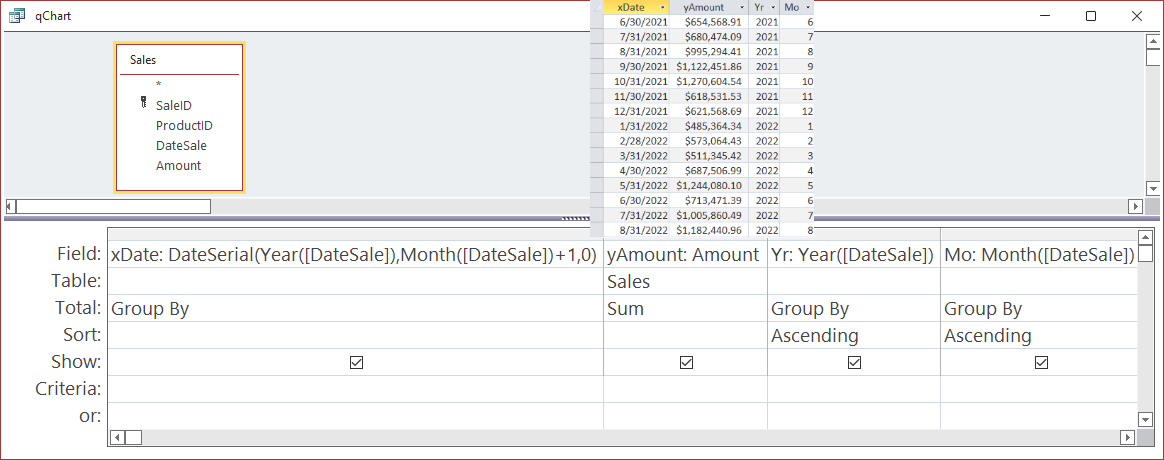
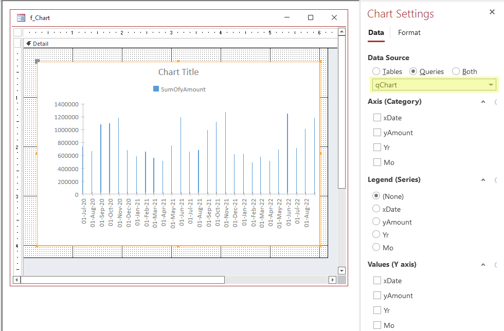
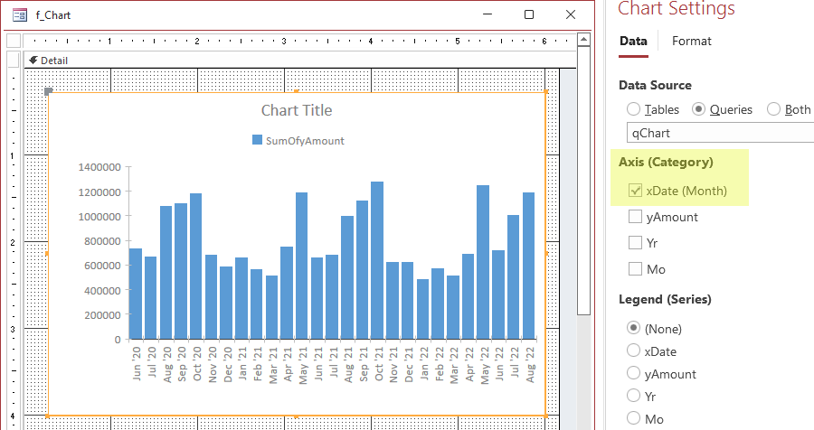
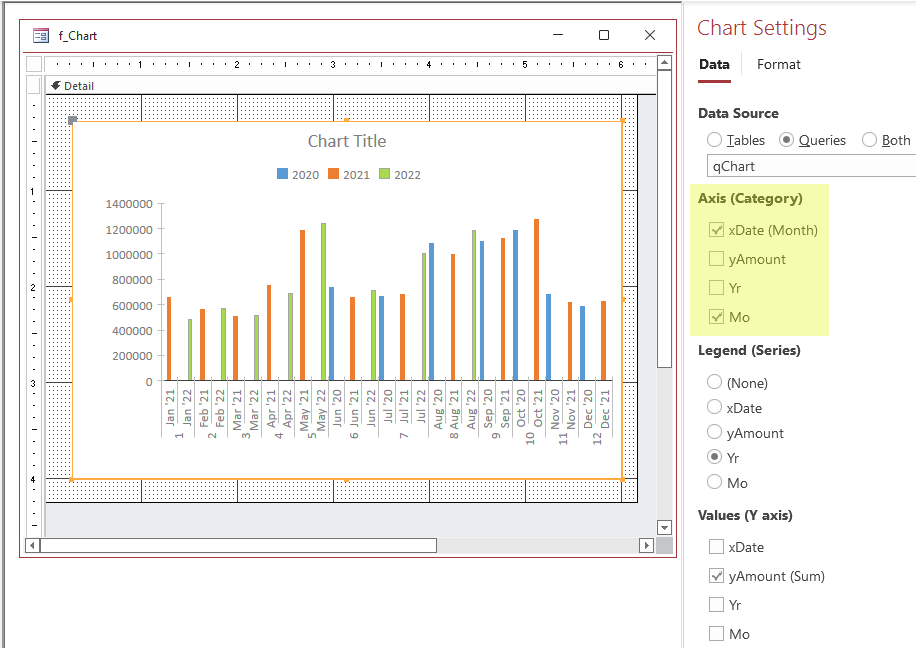
As a minimum, a chart needs 2 things: something on the X-Axis (horizontal axis, Category Axis) and something on the Y-Axis (vertical, Value Axis). This example prefaces names with "x" and "y" to make that clear. For the Category axis, because sales are being reported by month, dates are converted to the last day of the month, or End-Of-Month, EOM, using this expression:
xDate: DateSerial( Year(DateSale), Month(DateSale)+1, 0)The reason this is done instead of using Format to extract month and year is because Modern Charts need the date data type for proper sorting. Even though the query is sorted, Modern Charts don't respect that as Classic Charts do.
SQL:
SELECT DateSerial( Year(DateSale), Month(DateSale)+1, 0) AS xDate , Sum(Sales.Amount) AS yAmount , Year(DateSale) AS Yr , Month(DateSale) AS Mo FROM Sales GROUP BY DateSerial( Year(DateSale), Month(DateSale)+1, 0) , Year(DateSale) , Month(DateSale) ORDER BY Year(DateSale) , Month(DateSale);
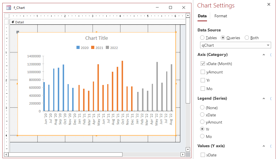
To make months of a year go next to each other so you can compare each month to the same month in another year, add month (Mo) to the category.
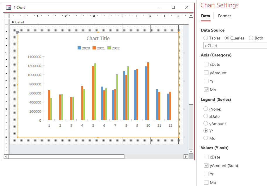
If the date field is removed from the category, we are just left with the month number,
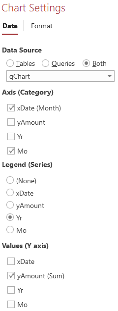
so we won't keep it that way, and for now, put the date field into the Category again.
As changes are made in the chart settings for data,
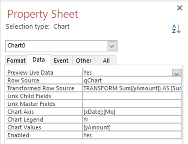
they are reflected on Data tab of the Property Sheet, and you can also change them there.
Modern charts create a TransformedRowSource, which is read-only, and used for the chart. Here is the SQL statement that Access generated based on the settings:
SQL:
TRANSFORM Sum( yAmount ) AS SumOfyAmount SELECT Format( xDate , "mmm 'yy") , Mo FROM qChart GROUP BY Format( xDate , "mmm 'yy") , Year( xDate )*12 + Month( xDate )-1 , Mo ORDER BY Mo , Year( xDate )*12 + Month( xDate )-1 PIVOT Yr
In the SQL, TRANSFORM is the keyword that CrossTab queries use to PIVOT information.
While the transformed row source is useful for tweaking the appearance, it is frustrating because it can't be changed directly. While you do have control over the Row Source property, the final chart uses the Transformed Row Source.
In this case, the date format is "mmm 'yy" which is okay but my preference would have been "mmm-yyyy". I would also change GROUP BY to be by year then month, and ORDER BY to be simply by date. These clauses have minds of their own though.
Property | Value |
---|---|
ChartTitle | Monthly Sales |
HasSubtitle | Yes |
ChartSubtitle | mid-2020 to mid-2022 |
PrimaryValuesAxisDisplayUnits | Thousands |
PrimaryValuesAxisFormat | #,##0 |
BackColor | RGB(240,250,252) |
BorderStyle | Solid |
BorderWidth | 2 points |
BorderColor | RGB(30,70,200) |
Top | 0.1 inch |
Left | 0.1 inch |
Form Properties | |
RecordSelectors | No |
NavigationButtons | No |
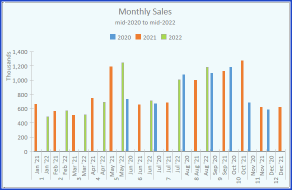
Here is the result
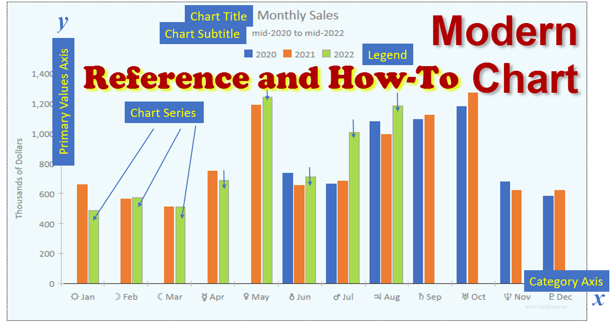
Instead of using display units to label the primary axis with just "Thousands", I'd rather give the axis a more descriptive title. Dividing by a thousand can also be done by additing a comma to the end of the format code.
Changed these properties:
Property | Value |
---|---|
HasAxisTitles | Yes |
PrimaryValuesAxisTitle | Thousands of Dollars |
PrimaryValuesAxisDisplayUnits | None |
PrimaryValuesAxisFormat | #,##0, |
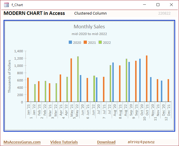
Now the chart looks like this:
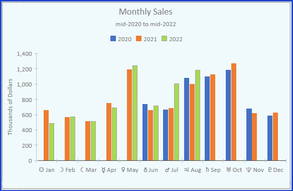
More could be done. GapWidth and GapDepth can't be set like they can with classic charts; however, classic charts don't have grouping one series into what appears to be different series either. To have wider columns, you can make a crosstab query to use for the row source.
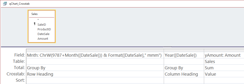
To get the month names to sort right, they are prefaced with a Unicode character using the ChW function. I glanced to see if there are official symbols defined for the months (I thought there were, somewhere) but didn't find them, so sun, moons, and planets were used. The first thought would be to just use the month number itself, but that could be confused for a date. Any symbols can be used as long as it will put the months in chronological instead of alphabetical order. Symbols for each month could also be stored in a table.
Mnth: ChrW( 9787+Month(DateSale)) & Format(DateSale, " mmm")
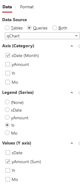
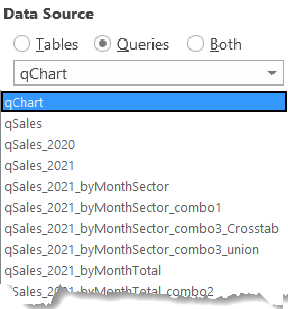
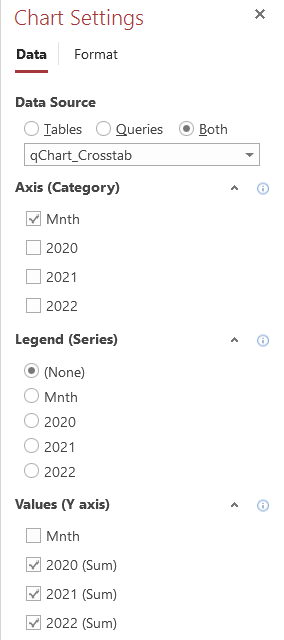
Here is the Data tab of the Chart Settings. The Data Source (Row Source property but not what the final chart uses) is a query called qChart_Crosstab.
Just one field is specified for the category x-axis, which is the expression with a sort character and then the month name abbreviation. No further grouping is specified. Multiple series are chosen for the values y-axes.
Because the source query is already a crosstab, the transformed row source is a totals query that doesn't pivot or transform.
SQL Transformed Row Source:
SELECT [Mnth] , Sum([2020]) AS [SumOf2020] , Sum([2021]) AS [SumOf2021] , Sum([2022]) AS [SumOf2022] FROM [qChart_Crosstab] GROUP BY [Mnth] ORDER BY [Mnth]
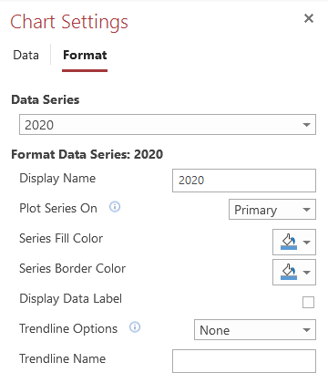
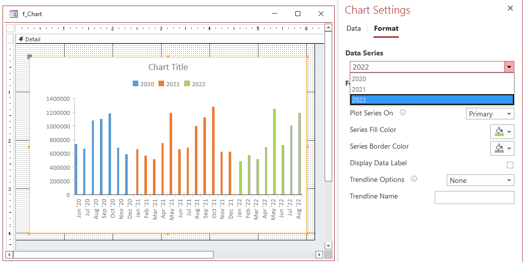
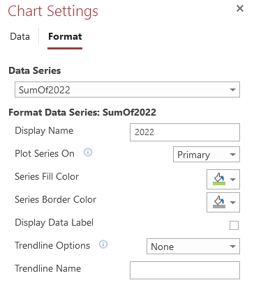
Here is the Format tab of the Chart Settings, where you can set a display name, color, and more for each series. There don't seem to be any exposed properties on the property sheet for format properties of each series. The chart legend shows the Display Name for each series.
YouTube link: AL: Modern Chart Improvements in Access with Maria Barnes (52:52), October 2024
Like many others, I used to skip charting with Access and go straight to Excel ... not any more.
I've used classic charts a long time (many years). For flexibility and variety, modern charts are a bit disappointing. However, modern charts are nice when you want to put them in the detail section of a continuous form since that's something you can't do with classic charts. Modern charts also have a PreviewLiveData property (default = True) so you see changes in the design view as you make them. Modern charts have the basics, so they can display what you'll want in most cases.
Often, Help doesn't specify the data type and guesses had to be made. I've done my best to be accurate, but also changed things to be logical.
This is a long page, and took a long time to create. In all honesty, I created it for myself, to document what can be done with VBA. If you find it useful, share with others and share with me ~ thanks
ps, I still use classic charts since they're more powerful, programmable, and still supported! Many seem to find the modern charts easier to create and change. Modern charts definitely look better out of the gate, and there are some new interesting chart types
Thanks to Maria, for showing the new chart types for Access Lunchtime. and Thanks, Access Team, for continuing to make Access better.
the simplest way is best, but usually the hardest to see ~ crystal